
904.207.7527
New Whites/Neutrals for 2026
Color is king when it comes to composing a room. It is truly a symphony when the color is balanced, with soft, quiet moments and then crescendos of emotion. Color choices can make or break an otherwise great room. Why is that!!
People don't usually know the value of a color statement. Color can help to define their style. They either have too many colors in a room or not enough. Two important rules:
1. Calm the room by streamlining the quantity of colors. Avoid the visual confusion of too many colors. Use fewer and the room is inviting.
2. Then then decide where we want the eye to fall. Color draws your attention to the focal points.
It's not just the color itself but the color saturation that creates impact or serenity. The placement of each color as well as the intensity... all elements play a part.
First things first: pick a combination of 3 to 4 colors. Some should be neutrals and some need to be mood setters in the room. You can begin with a fabric or piece of art or even a photograph. This step usually helps avoid the problem of putting soft, muted shades with bright and strong colors.
Sherwin Williams has a tool that can establish a color scheme based on a photo or piece of art. Check out this exterior tropical color statement. The body of the house can be the cream or the khaki color with black trim. The shutters can be the coastal blue and the Terra Cotta front door can say, "Come Right In."
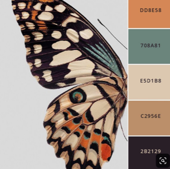
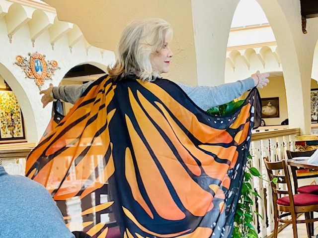
The butterfly Color Snap image, for example, pulls all the key colors out of a nature scene. It can also be a fabric or piece of art. This is my own personal color story. AND, I am a big fan of butterfly things, as you know.
What do you think of this next color statement?
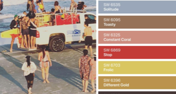
Something about this picture just makes me happy. It was snapped late in the day on the 4th of July this year. I love all of these colors together, don't you! This combo could be for a vacation place.
Be prepared... stronger and darker colors are coming. Mossy green and navy are making a comeback. Wait and see. You will grow accustomed to it.
The new HGTV house is covered in neutrals accented by moody colors... navy and dark teal. Look out for some navy shower tile. It's dramatic and soothing at the same time. Also, expect to see terra cotta, taupe, deep green and gasp... burgandy/raspberry. Just when we obliterated it from the universe.... it's baaaack!!
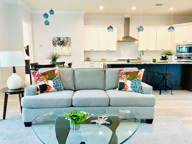
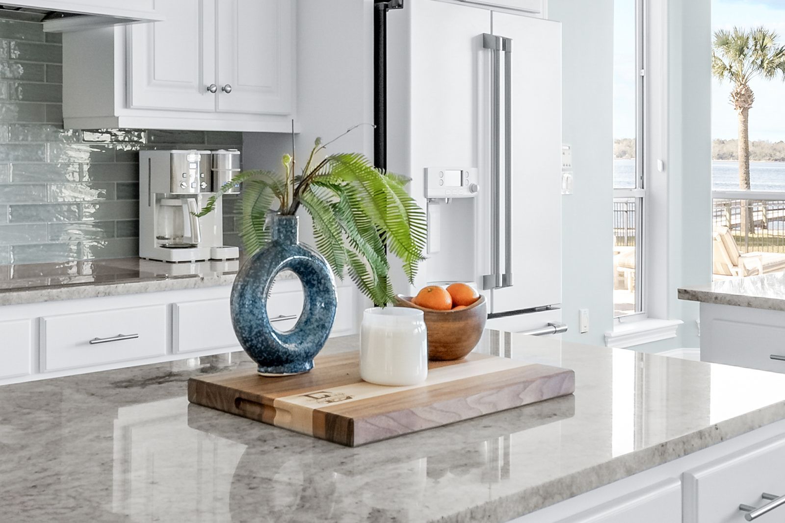
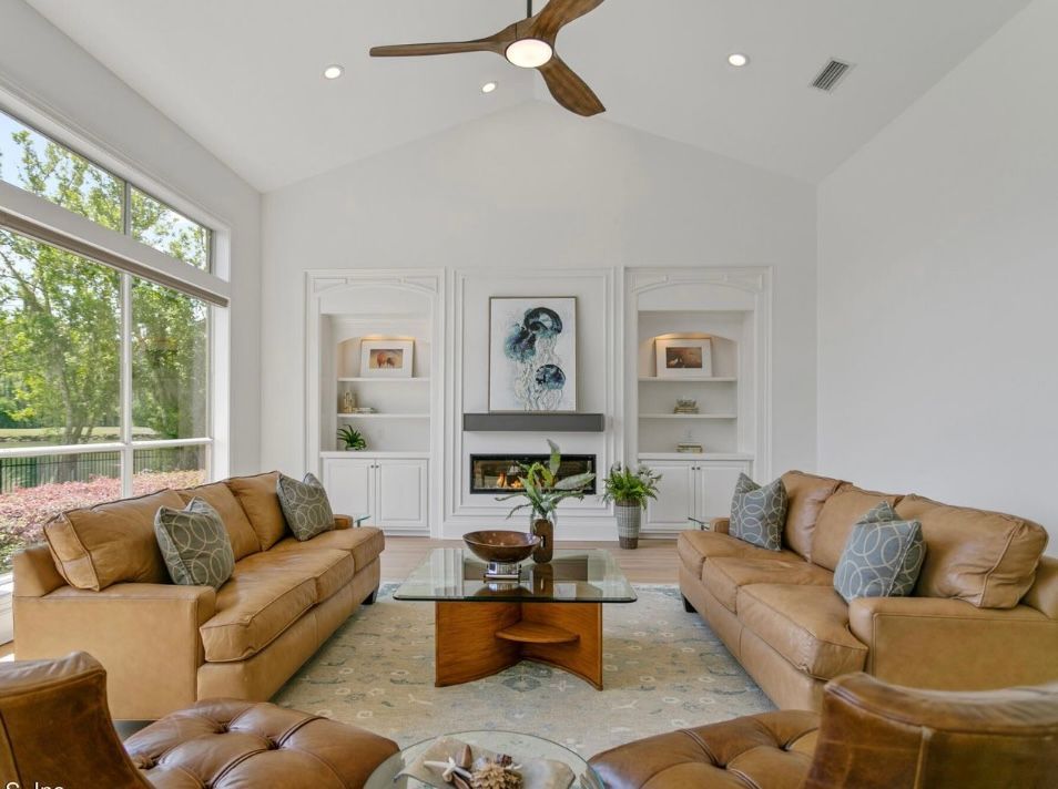
This living room is more typical of our coastal area. Soft ocean blues... always in vogue. Timeless style. Nice!!
As we enter 2026 next month, be open to new ways of thinking to create a cohesive and relaxing room. Many elements need to come together.
Our color segment of the Certification Class is designed to equip you to visualize and create a balanced color story. If you get everything else right but miss the color statement, you have not succeeded in your job. It's that important!!
We promised some new whites and neutrals for 2026...
The color of the year for Sherwin Williams is Universal Khaki. This color has been a favorite for exteriors for decades. Its lighter companions are Relaxed Khaki and Wool Skein. The body of the house can be Relaxed Khaki and the trim can be Universal Khaki. The door and shutters can be the Wool Skein, which appears almost white. Any combo of these colors can work. You can throw in a bold color door for contrast, such as Refuge or Oakmoss.
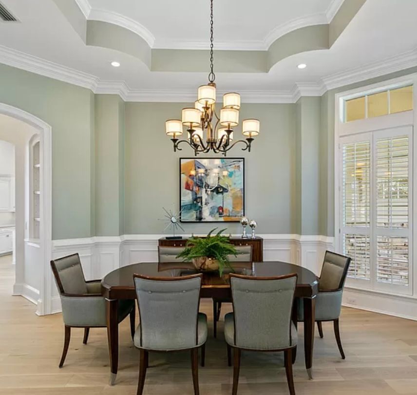
Universal Khaki is a beautiful, darker interior color also. Maybe an intimate dining room or bedroom needs some drama and warmth.
My big freebie no no... Do not paint your home exterior in a light, bright white. It looks artificial and glaring. Colors are brighter in the sunshine. Go deeper and it will look more professional.
Exterior and interior painting can cost into the tens of thousands. Pay for a quick consult to prevent mistakes.
My fave whites for interior walls are, Shoji White, Panda White, White Duck, Neutral Ground. The lighter whites are Alabaster, Pure White and Snowbound.
Free samples are in your SW store.
Merry Christmas, my dearest old and new friends, and may 2026 be your Best Year Ever!!
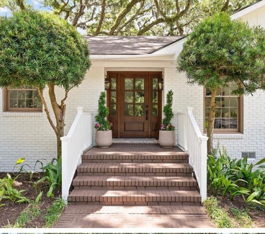
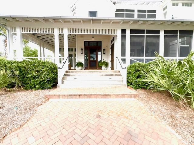
One more picture. This body is in Alabaster with Universal Khaki window trim... instead of the typical black. Nice! See you next time.